The Problem
Create a concept website redesign using HTML & CSS for a business of our choice (The Sock Factory) with a team of 4.
*Disclaimer: This was a hypothetical redesign case study for a school project, we did not make the website to be used by The Sock Factory.
Research
We started out by doing some research, we needed to learn what pain points users experienced when using the existing site and what kind of essence the business portrayed. We learned that The Sock Factory sells various types of socks, but they definitely stand out the most for their quirky/fun socks. The website that they had at the time didn’t really showcase that at all and the usability was very difficult; there wasn’t a clear direction of focus and that is what we wanted to change with our design.
The Users:
Through our research we learned that The Sock Factory aims to cater for everyone, since they offer various types of socks. They also offer events and discounts that target several age groups from children to seniors, meaning that we needed to create a design that was simple enough for people of all ages to navigate and find their needs met.
What do the users want & need:
• The website to be able to solve their problem
• See what the store offers
• Be able to make purchase
• Find the information that they are looking for (location, hours, deals)
Process
Site Map
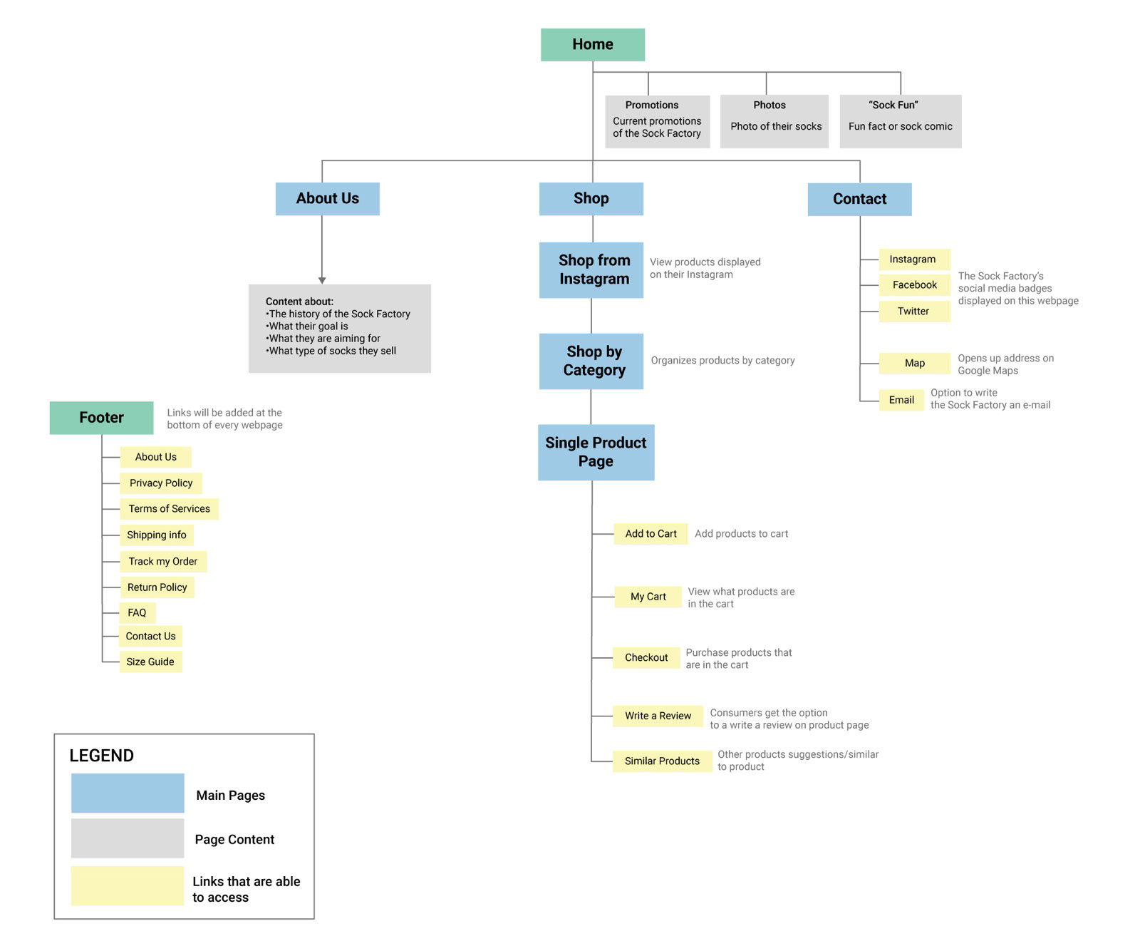
We created a new site map. Throughout this process aspects were added and removed in order to make ordering socks as quick and easy as possible.
Wireframes: Low Fidelity
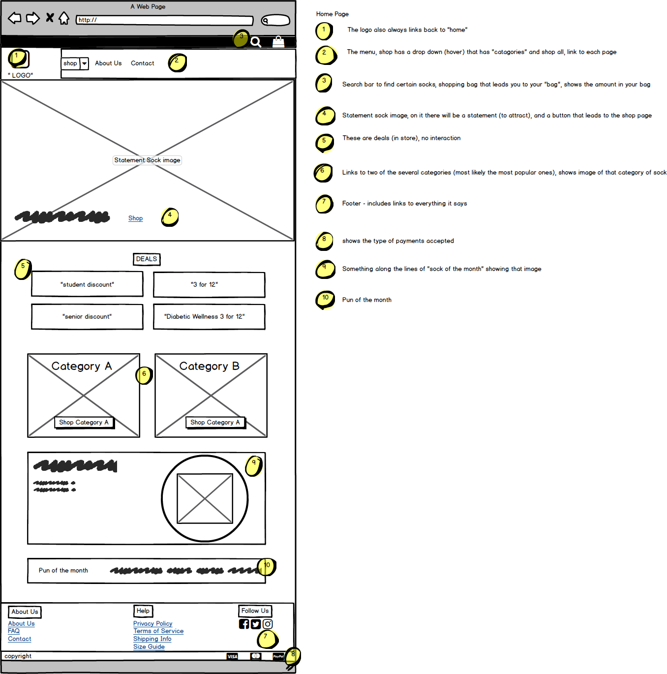
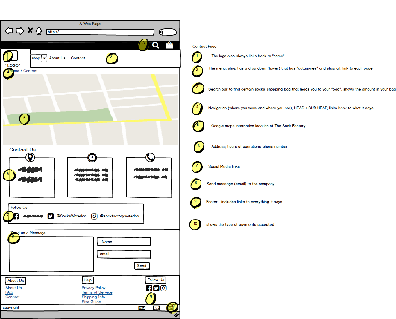
From this point we each took 2 pages from our site map to wireframe, I chose to do the HOME and CONTACT page which can be seen below.
These were a few aspects I needed to take into consideration when creating my design for an e-commerce site:
• How do you show visual hierarchy?
• What do users expect when it comes to usability? Where should certain aspects go?
• How do I make sure the user gets all the information that they need?
Mockups: High Fidelity
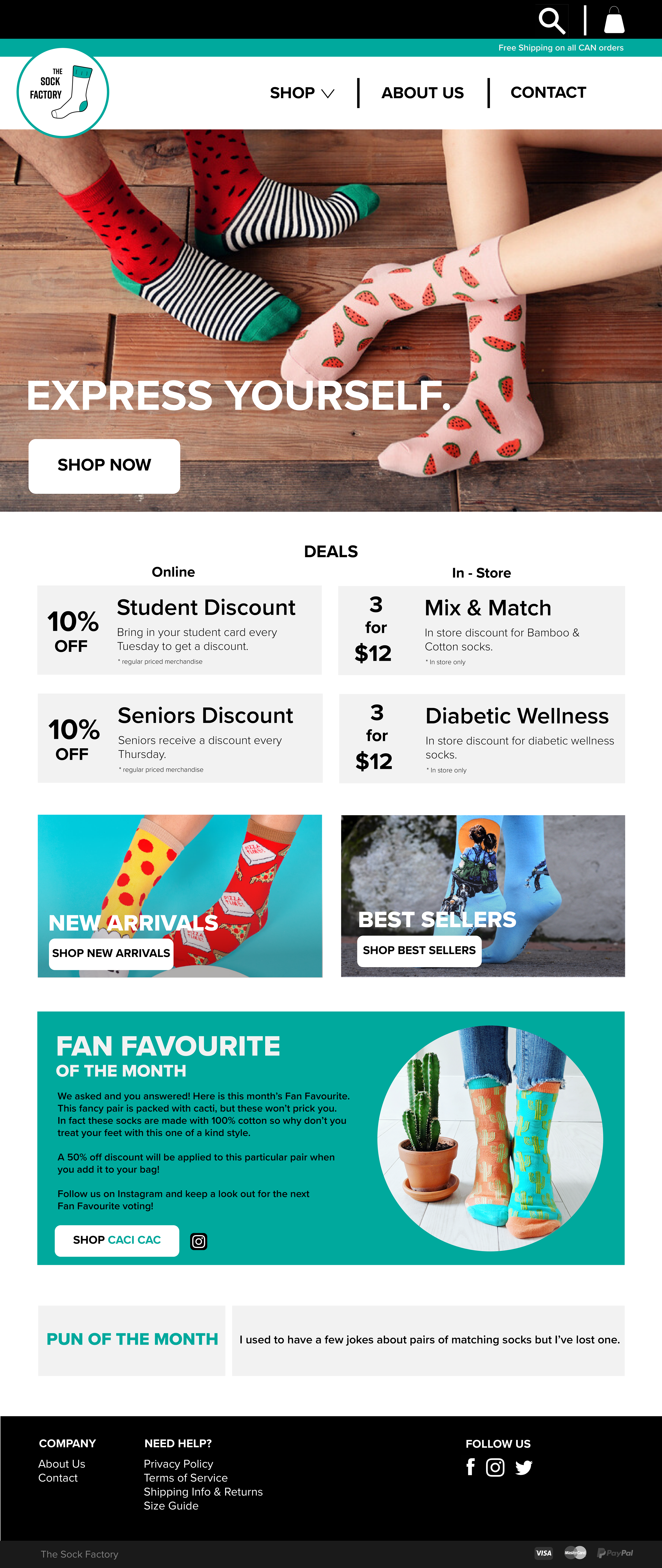
After receiving feedback, I went ahead and created high-fidelity mockups for the HOME and CONTACT page. The whole team liked the design so we used it as a base for our website.

The Result
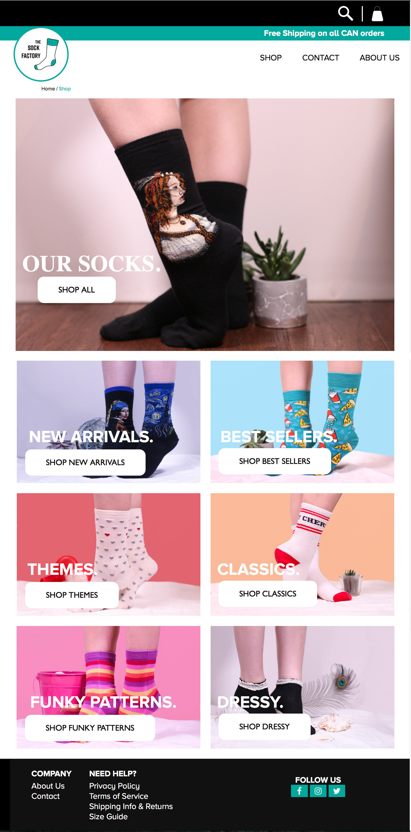
We split up the pages we were going to create with HTML & CSS, I worked mainly on the HOME page (see above) and BEST SELLERS page (see below). I also shot most of the product pictures which can also be seen below. The design wasn't changed much from the high-fidelity mockups to the end result, just slight tweaks here and there. The main focus now was to make our site responsive.

Key Takeaways
One of the biggest issues that we came across was lack of consistency. This happened because each of us had to work on several pages at once, and because everyone worked at a different pace it made it difficult to remain consistent. If I were to do this again I would change up how we organized our roles in order to put consistency at the forefront.
All in all, this was an excellent learning experience that really heightened my interest in UI and UX.