UX Case Study
01 PROJECT OVERVIEW
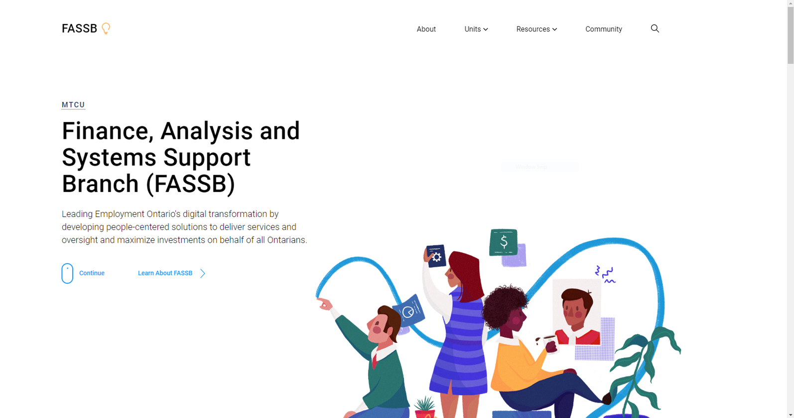
I had the opportunity to intern at the Ontario Ministry of Training of Colleges and universities in Toronto. Within the ministry I worked at there are several branches one of which is known as FASSB (Finance, Analysis, and Systems Support Branch).
This organization is a government branch that leads the financial planning, corporate reporting, and risk management for the ministry.
Within FASSB I was part of the Digital Business Unit. Responsible for leading Employment Ontario’s Digital transformation by developing user-centered solutions while supporting the delivery of programs and services to Ontarians.
During my 4 month internship I worked as a UX and Web Designer to redesign, develop and expand their internal website to be used by all employees internally within the branch and act as a centralized hub. The previous website had only been partially built by previous interns and was incomplete.
ROLE
User Experience Design
Visual Design
Web Development
TEAM
Initial Leads: Jessica Smith & Ronal Badilla
Final Leads: Maureen Huxter & Deirdre Corbett
Manager: Kaye Lawrence-Haye
UX & Web Designer: Colin Strength & Emilia Lilek
TIMELINE
4 Months
TOOLS
Figma
Webflow
Wordpress
SCOPE & CONSTRAINTS
To start we needed to ensure at the end of the 4 month timeline that we:
- Complete the backlog
- Ensure the site is functional and scalable
We were taking over the work of the previous design interns. We had a lot of great information to work off of.
As a starting off point we had:
- Access to all their user research, they had conducted interviews, created personas, and analysis
- A partially developed site through word press and Figma files
- A backlog of tasks to complete
After doing an initial analysis of the site we did notice some design inconsistencies and issues with the back end. More specifically there was no established design system causing some consistency differences between the pages. There also wasn't a system for maintenance and upkeep established which made it harder for others to make edits or updates to the site. Some elements had broken responsiveness as well. This helped inform the path forward.
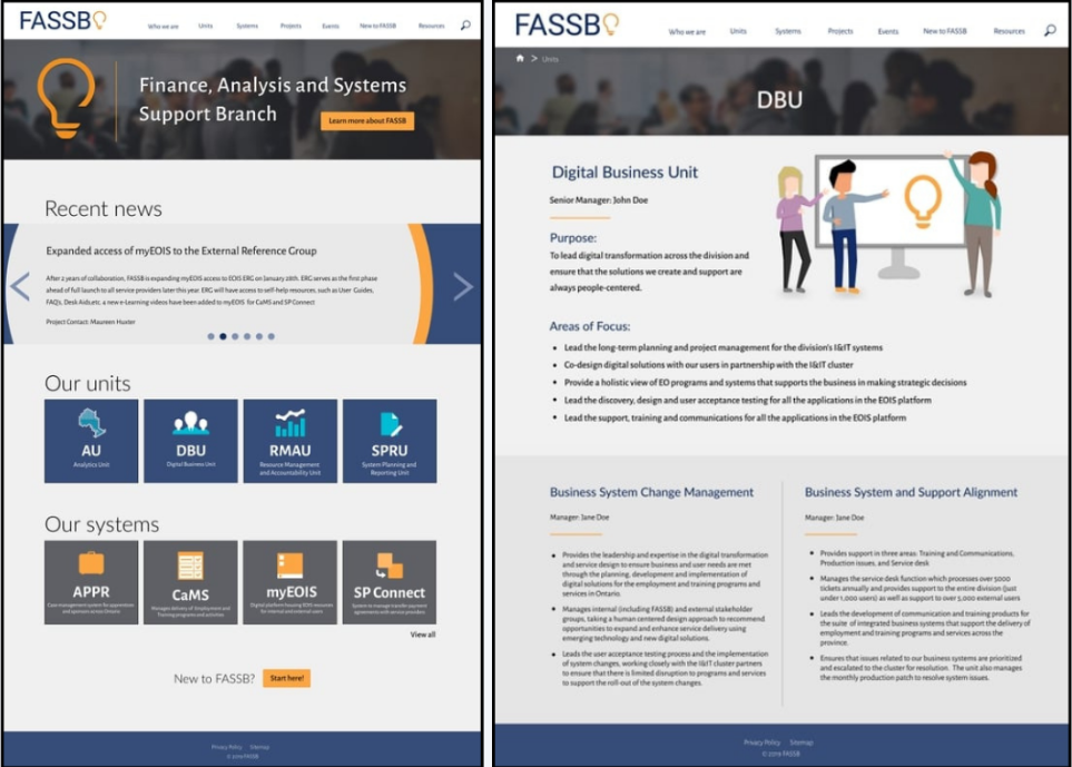
A look at the previous site.
UNDERSTANDING THE PROBLEM
Colin and I began analyzing the existing data from the user research done by the previous designers. We had a limited timeline so having all this data was very helpful. We also audited the previous work to gain a greater understanding so we could form out insights.
From this we learned the following top pain points:
- Scattered resources leading to redundancies: Users were frustrated that resources (important documents, guides, and information) were scattered which was leading to redundancies across the organization. There was a sheer amount of content but a lack of current structure.
- Lack of context: Users felt they were missing context on the work being done within the branch. They were unable to see the big picture between their work and the goals of the ministry, and felt disconnected between the different units that made up the branch as a whole.
- Difficulty finding common information: Users had difficulty finding best practices, tips, and onboarding information. Which comes back again to the overwhelming amount of content, which seen in many government organizations.
GOALS
With these problems in mind, here is a look at the goals to address them:
- Create a centralized location for resources with an integrated CMS.
- Summarize each unit within the branch including project information.
- Streamline content organization, and provide easy access to common information, guides, and quick tips for staff.
HOW MIGHT WE?
Which brings us to our how might we statement.
" How might we redesign the FASSB website into a centralized location that allows employees to efficiently find resources, documents, and answers?”
Part 02 Design
INFORMATION ARCHITECTURE
One of the first things we tackled after analyzing the previous data was redesigning the site map. As I mentioned earlier, there was a lot of content within the organization, so it was important that we were able to further streamline the organization of the site. We mainly focused on condensing common categories into drop downs so that there were less seen all at once. Overall improving the ease of findability so that users could quickly scan and find what they are looking for.

WIREFRAMES
Next we started working on our low-fidelity wireframes. We prioritized creating designs for the pages from the backlog while also working towards modernizing the existing designs to ensure consistency across the site. Give our timeline constrains, we prioritized early testing to validate our designs to ensure we were heading in the right direction.
From these tests we were able to identify features to keep and refine and removed ones that were not necessary. Users also responded positively to the more modern design, especially with the increased white space, layout, and fonts. This information helped inform the beginnings of our design system.
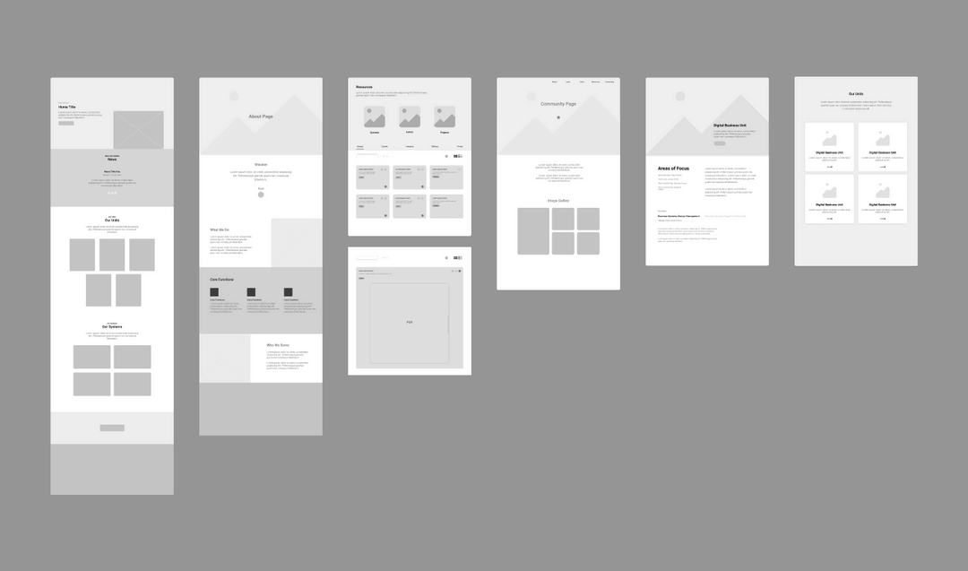
One version of our wireframes.
USER TESTING
All of our user testing was conducted in person. We tested with small groups of 12 employees across the different units within the branch. We would use the Think Aloud testing method which gave us a lot of flexibility to gain important insights across the different stages of the design process, especially when considering our time constraints. Colin and I also conducted Comparative testing when we created two very different designs each.
MOCKUPS
After validating our wireframes through user testing, we worked towards creating hi-fidelity mockups that we then presented in following user testing sessions. We learned a lot through testing. Some main insights were that we needed to improve visual clarity. At this point we were getting the final content that we needed to add to the website and users were feeling at times that it was difficult to digest, so we worked towards further breaking up information into digestible chunks. Next we needed to refine our visual consistency across pages, for example ensuring buttons and colours were all consistent. Creating a design system helped us streamline this process. We also worked towards improving accessibility, making sure that we aligned with the AODA standards across the board. At this point we were also beginning to validate what was actually possible to create during the development phase.
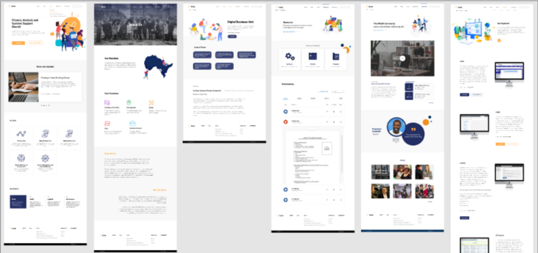
Early mockups.
REVISITING INFORMATION ARCHITECTURE
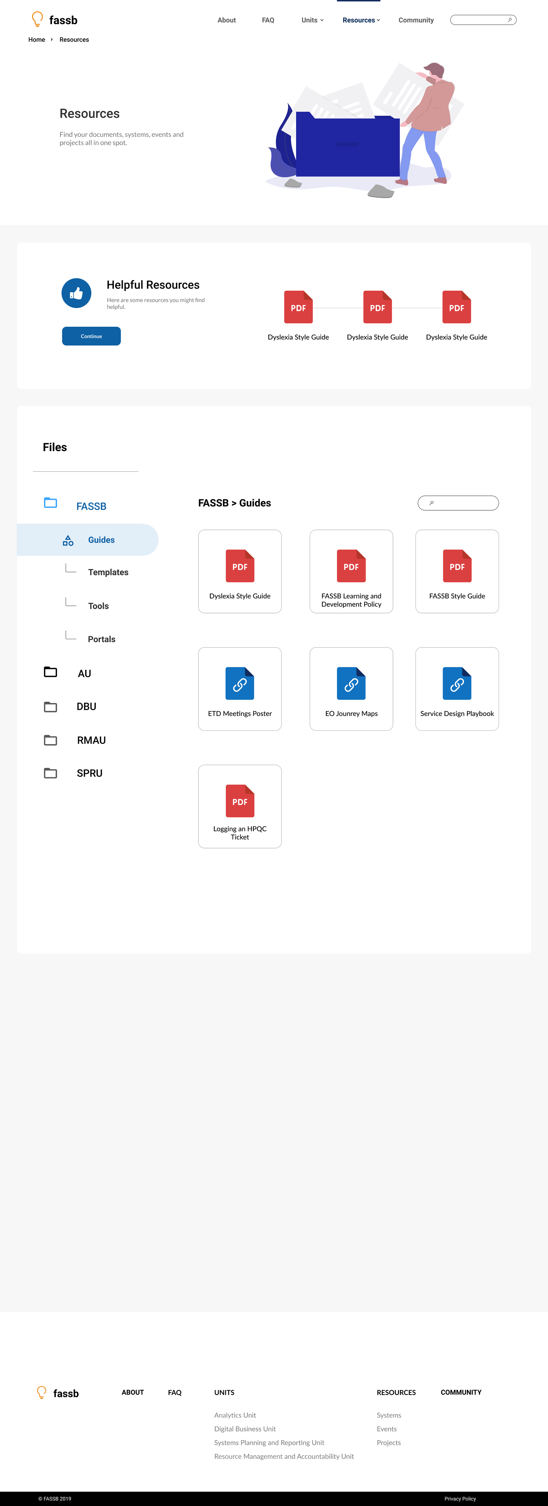
One of the biggest goals in this redesign was to create a centralized location for resources with an integrated content management system, to tackle that main pain point of having scattered resources everywhere making it difficult to find and manage. The solution ended up becoming the resources page. We needed to ensure that it was built in a way that was easy to use, update, but also made sense to our users. A big concern users had was that it would feel like a dump rather than something with structure.
To figure out how to best categorize, discover, and organize resources we conducted a focus group with 12 people around the branch and had them complete a card sorting activity and test our existing designs.
Through the card sorting exercise we were able to inform the information architecture for this page. We were able to establish the kinds of resources and content users wanted to see and finally define the categories that made sense to them.
Through testing our design we learned that users were frustrated with the imbedded document feature and they preferred to just download documents. We also noticed that users were having a bit of difficulty with navigating. With the previous design we were only able to add so much content and after learning about how much content we needed to include, we knew we needed to change this. We looking into other file management systems that were successful in this, for example google drive.
You can take a look at these changes between the first version, and second, below.
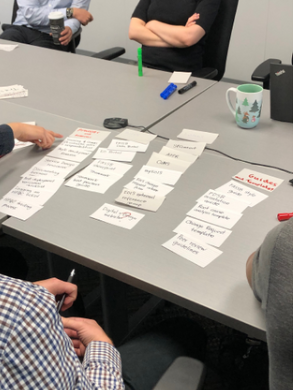
A look into the card sorting activity.

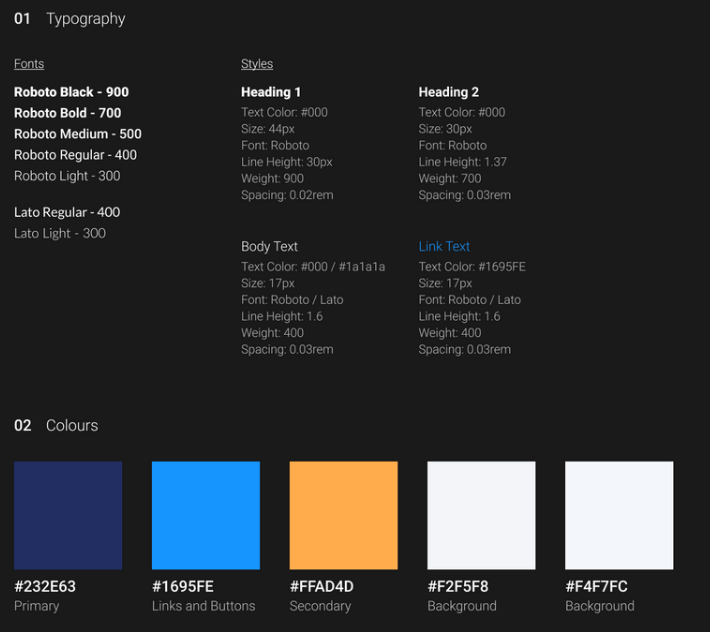
DESIGN SYSTEM
Establishing a design system was important as we knew that there would be future designers who would continue off of our work in similar time frames. This would give them an opportunity to collaborate more easily, and open up time for more pressing tasks.
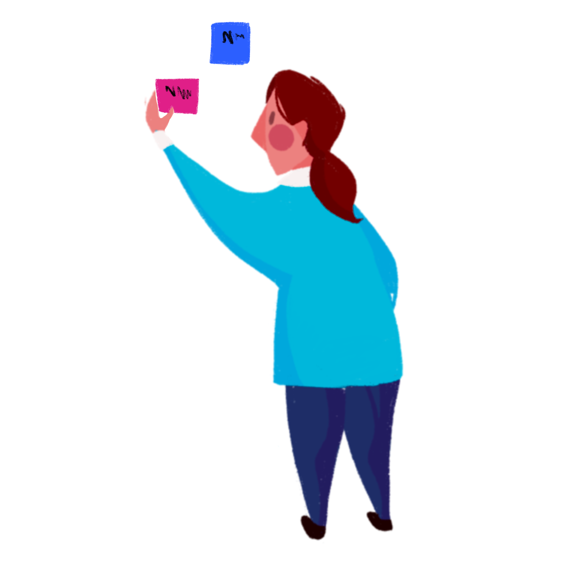
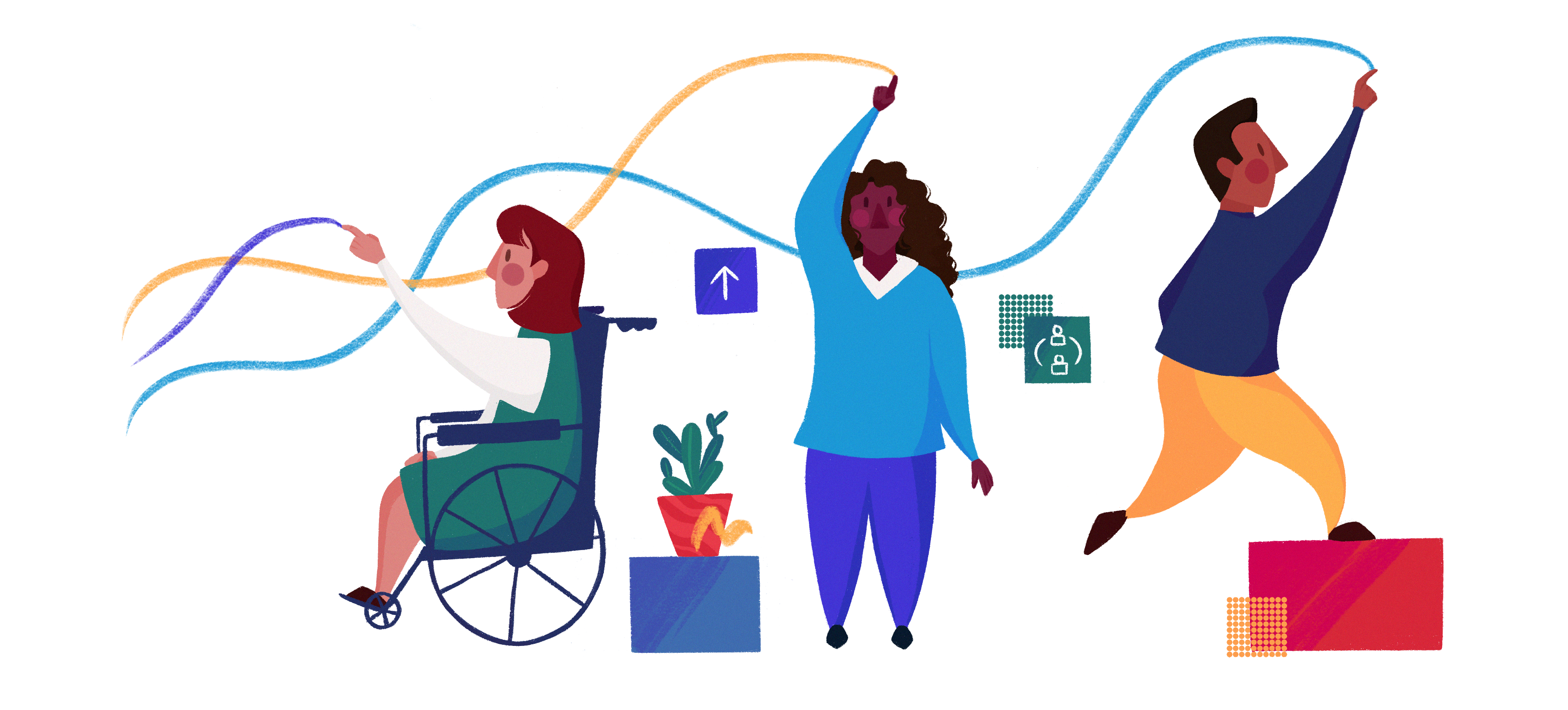
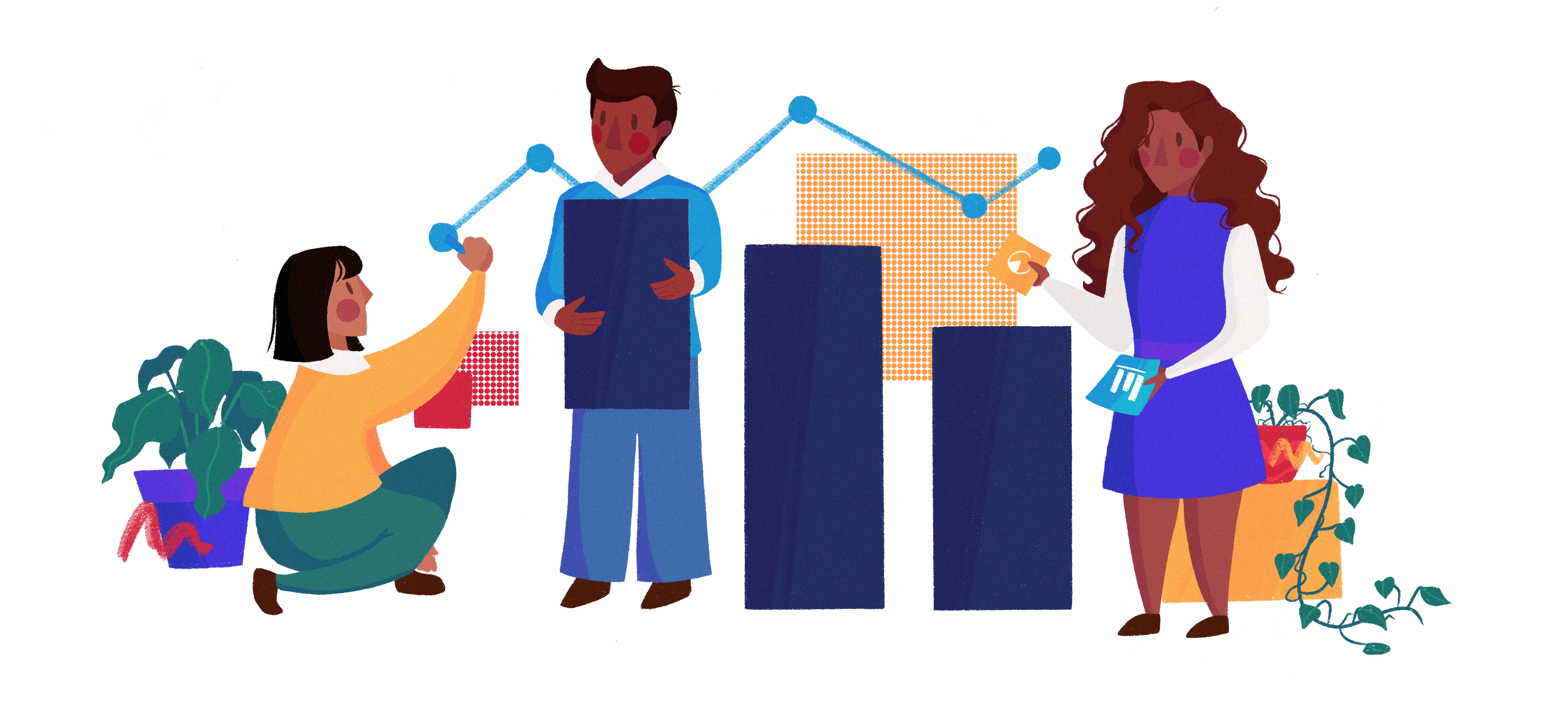
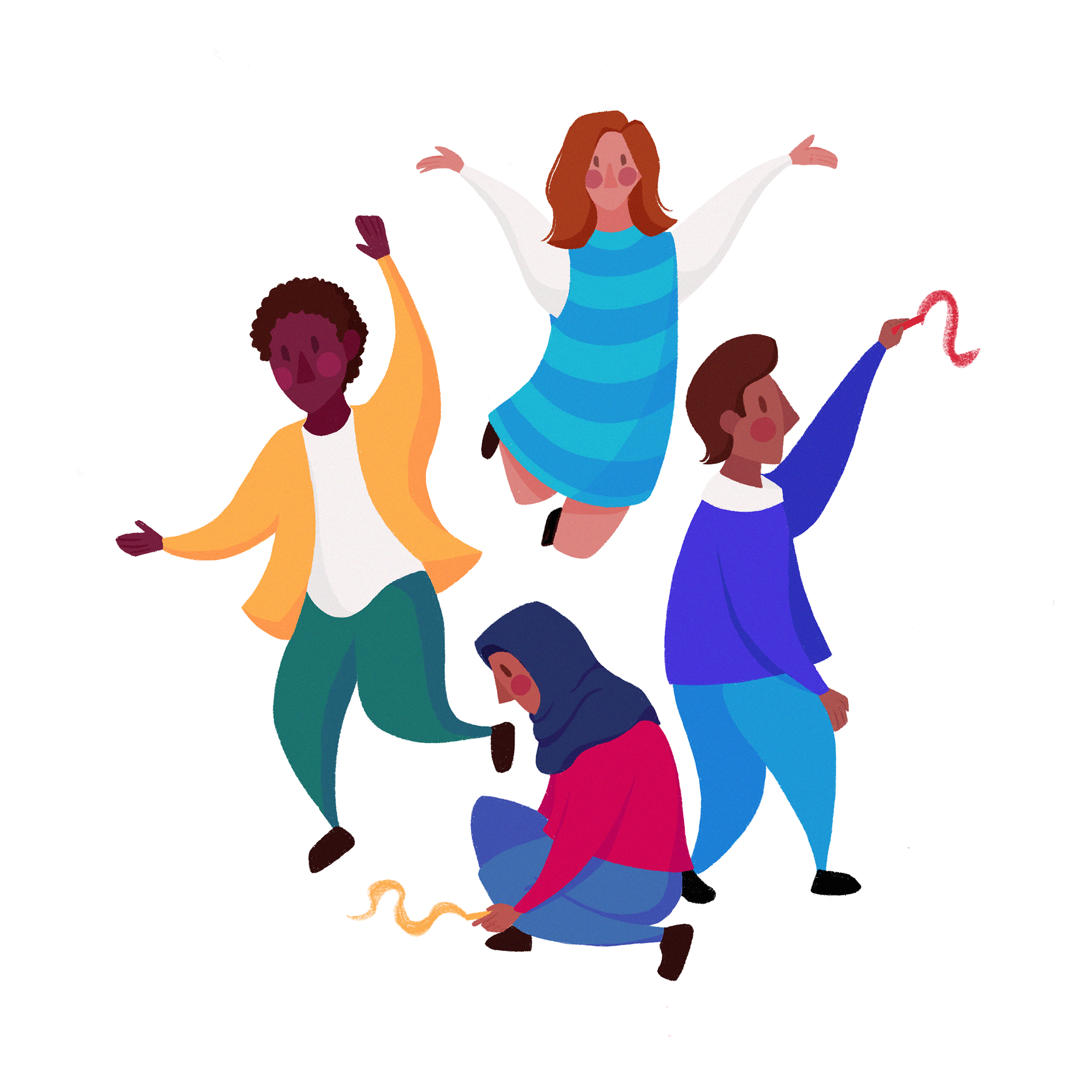
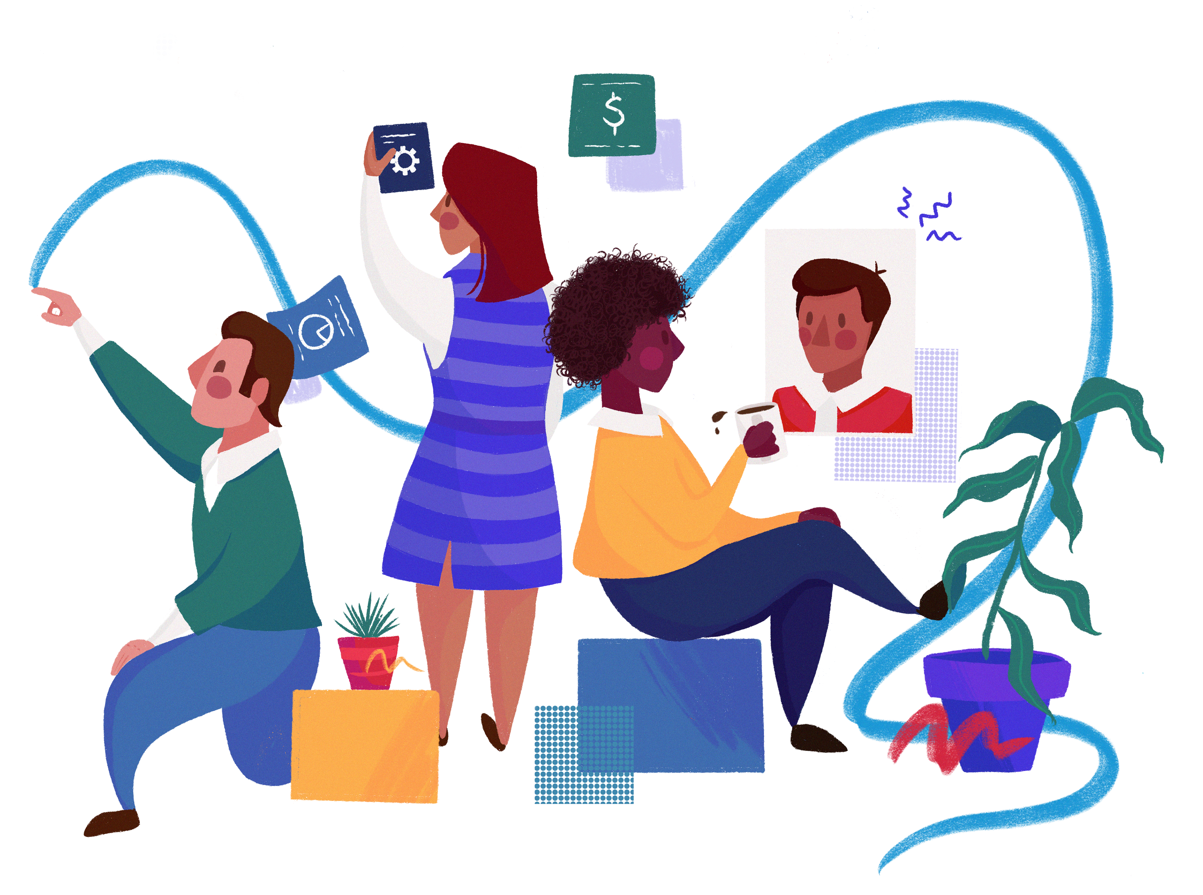
One aspect of our design system that I worked towards developing were custom graphics to bring the site to life. This was also important to establish that consistency but also ensure that the visual design reinforced and represented the branch's commitment towards diversity, inclusion, and accessibility. I noticed an immediate positive reaction to the designs and continued engagement.

Part 03 Web Development
For web development we used Web Flow and Word Press. Colin was the most experienced with this so he took the lead in web development. I assisted in some of the less complicated pages.
Part 4 The Results
After a final test to identify and fix final bugs we were able to achieve all of the requirements set up in our scope. We had a functioning site in which we saw a significant traction of users using over the previous one with an overall positive response. Due to the time constraints, we weren't able to do significant tracking, however we did set up analytics so that future designers could continue to track usage.
We prepared and organization all of our information and documentation to ensure a smooth transition for the next group of interns.
Working on this project I learned a lot about creating a consistent image, accessibility, and web development. It was one of the first projects where I was able to directly see my impact on a business and it's needs in a real setting. After doing some reflection, I would have tried to establish a style guide earlier on, in order to create a clear shared vision from the start. Due to our short time line, and due to the fact that there were two designers on this project, sometimes we needed to spend more time consolidating existing work, because we did those explorations separately which overall cut into our time.
All in all this was an incredibly awarding project and I really enjoyed working on it!